

Aspect Ratio Calculator
Calculate aspect ratios, resize dimensions proportionally and find common ratios for any resolution.
What is an aspect ratio calculator — and why does it matter?
An aspect ratio calculator tells you the ratio between the width and height of any image, video, or screen resolution — and lets you resize dimensions proportionally without distortion. The aspect ratio is expressed as two numbers separated by a colon, like 16:9 or 4:3.
Getting aspect ratios right matters everywhere: video production, web design, social media graphics, print layouts, and responsive design. A wrong ratio means stretched images, black bars, or cropped content. This tool calculates, converts, and resizes in seconds.
How to use this free aspect ratio calculator
- Enter your original width and height in the Original Size fields
- See the aspect ratio instantly — shown as a ratio (16:9), a decimal (1.778), and a visual preview
- Resize proportionally — enter a new width or height in the Resize section, the other dimension calculates automatically with the aspect ratio lock
- Browse common ratios — click any ratio (1:1, 4:3, 16:9, 21:9 etc.) to see matching resolutions
- Browse common resolutions — click any preset (HD 720p, Full HD, 4K UHD, Instagram etc.) to load its dimensions instantly
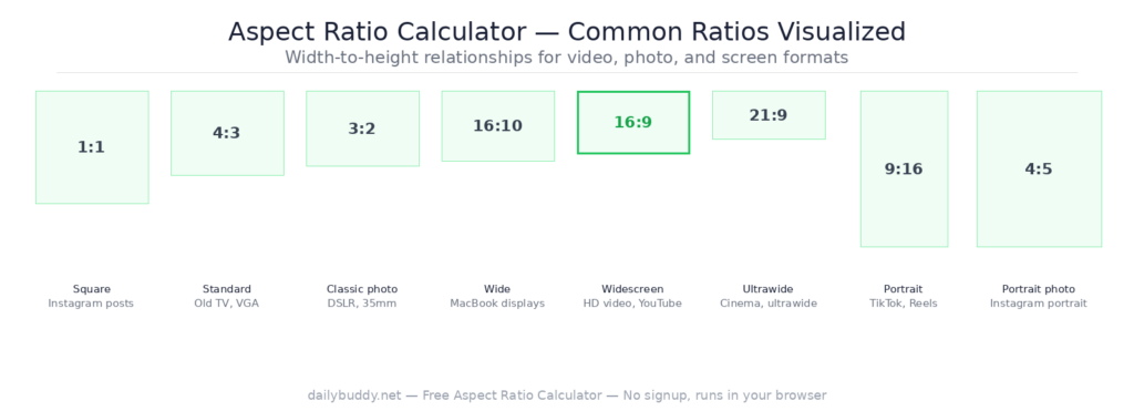
Common aspect ratios explained
| Ratio | Common name | Used for |
|---|---|---|
| 16:9 | Widescreen | HD video, YouTube, presentations, monitors |
| 4:3 | Standard | Old TV, VGA, XGA monitors, some cameras |
| 1:1 | Square | Instagram posts, profile pictures, thumbnails |
| 21:9 | Ultrawide | Ultrawide monitors, cinematic video |
| 9:16 | Portrait | Instagram Stories, TikTok, Reels, Shorts |
| 4:5 | Portrait photo | Instagram portrait posts |
| 3:2 | Classic photo | DSLR photos, 35mm film, prints |
| 16:10 | Wide | MacBook displays, some laptop screens |
Common resolutions and their aspect ratios
The tool includes 20 preset resolutions covering every major use case:
Video and displays:
- HD 720p — 1280×720 — 16:9
- Full HD — 1920×1080 — 16:9
- QHD — 2560×1440 — 16:9
- 4K UHD — 3840×2160 — 16:9
- 5K — 5120×2880 — 16:9
- 8K — 7680×4320 — 16:9
- UWQHD — 3440×1440 — 21:9
Mobile:
- Phone FHD — 1080×1920 — 9:16
- iPhone 14 — 1170×2532
Social media:
- Instagram — 1080×1080 — 1:1
- OG Image — 1200×628
- Facebook — 1200×630
When to use an aspect ratio calculator
Video production — before exporting a video, verify your canvas matches the target platform. YouTube and most streaming platforms use 16:9. Instagram Reels and TikTok use 9:16. Getting this wrong means black bars or cropped content. Once your video is ready, share it securely with DailyBuddy Send — encrypted link, optional expiration date, no file sitting in anyone’s inbox.
Web design and responsive layouts — maintaining consistent aspect ratios for images and embedded videos prevents layout shifts. Use the calculator to find the exact height for any given width. Compress your images to the right size afterwards with the free image compressor.
Social media graphics — every platform has specific dimension requirements. Instagram uses 1:1 for feed posts, 9:16 for Stories, and 4:5 for portrait posts. Calculate the exact dimensions here before designing. If you collect image specs or design briefs from clients, DailyBuddy Forms lets you build GDPR-compliant intake forms on EU servers — no coding required.
Image resizing without distortion — use the Resize section to scale any image to a new size while keeping the original proportions. Enter the new width, the height calculates automatically.
Print and publishing — A4, A3, and other paper formats have fixed aspect ratios. Calculate the pixel dimensions for any print size at your target DPI. Need to process or merge the final PDF? The DailyBuddy PDF toolkit handles it directly in your browser — no upload needed.
UI and product design — screens, cards, thumbnails, and modal windows all need consistent proportions. Calculate once, apply everywhere. Use the color palette generator to build a consistent color system alongside your layout work.
Why this aspect ratio calculator runs in your browser
This tool calculates everything locally in your browser. There is no server request — your dimensions and calculations never leave your device.
It’s the same approach DailyBuddy uses for its PDF tools, the image compressor, and the color palette generator — no upload, no server processing, no data collection.
Frequently asked questions
Yes, completely free. No account required, no usage limits.
No. Everything runs locally in your browser. Your dimensions never leave your device.
An aspect ratio is the proportional relationship between the width and height of an image, video, or screen. It is expressed as two numbers separated by a colon — for example 16:9 means the width is 16 units for every 9 units of height.
Enter your original width and height, then enter a new width or height in the Resize section. The other dimension calculates automatically while keeping the original aspect ratio.
YouTube uses 16:9. The standard resolution is 1920×1080 (Full HD) or 3840×2160 (4K UHD).
Instagram uses 1:1 (square) for feed posts, 9:16 for Stories and Reels, and 4:5 for portrait posts. The standard square size is 1080×1080.
16:9 is the standard widescreen ratio used for most TVs, monitors, and video. 16:10 is slightly taller and is used by some laptops and MacBook displays.
Since no data ever leaves your browser, nothing is collected, stored, or processed. There is nothing to protect.


